Sprint Burn-Down Chart
This page provides guidance on creating a Sprint Burn-Down Chart, as well as provides insight into the different shapes you might see in a Sprint Burn-Down Chart.
Pre-Requisites
The pre-requisite for creating a Sprint Burn-Down Chart is having a populated Sprint Backlog of estimated User Stories.
Purpose
A Sprint Burn-Down Chart is an artifact that is created throughout the course of a Sprint. This chart provides insight into how the Team is moving towards accomplishment of its Sprint Goal. It helps create transparency for the team, as well as for stakeholders. It shows how fast the team is going, and graphs visually how much work is left in the Sprint. Through looking at the chart, it’s very easy to see if the Team is headed in the right direction.
Mechanics
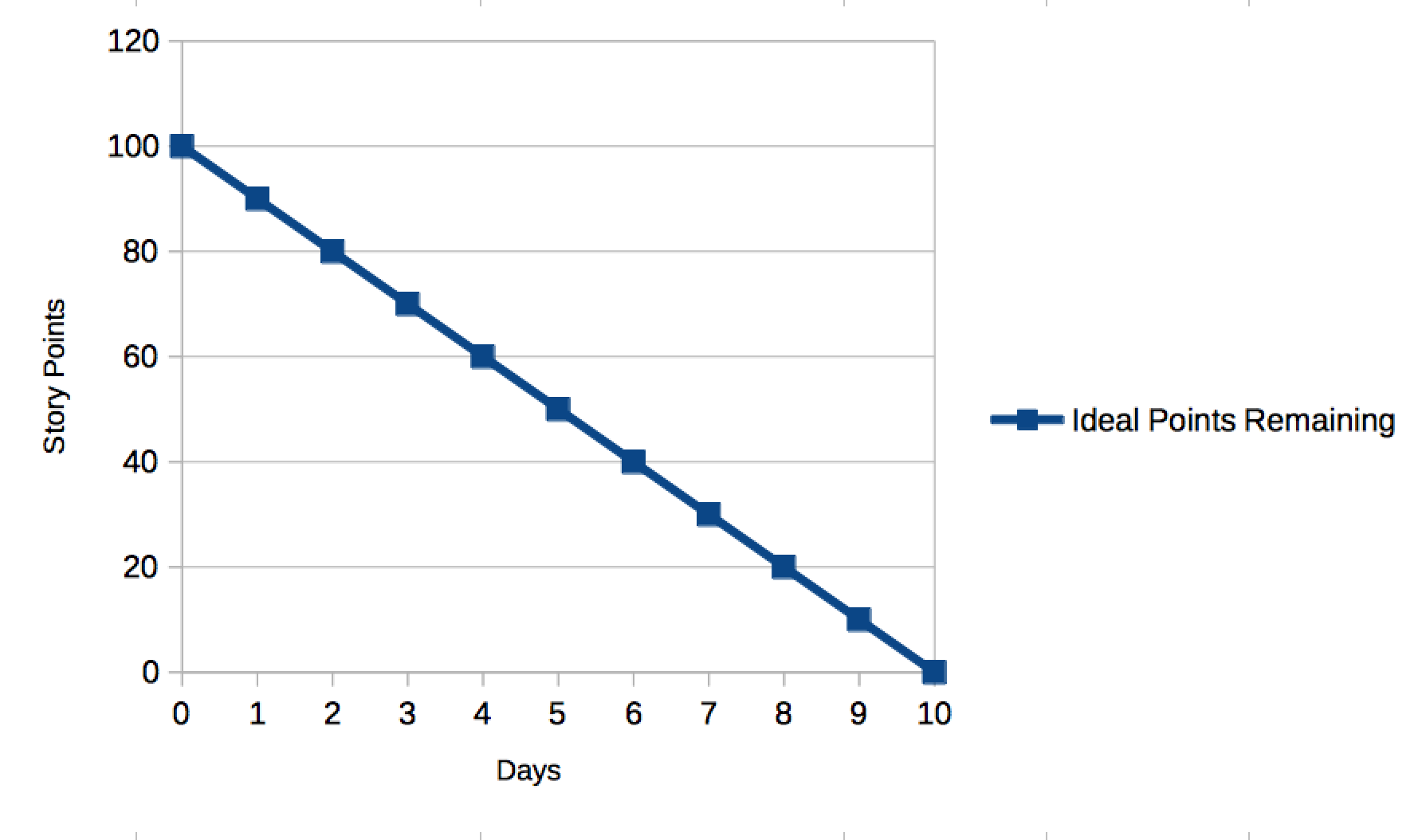
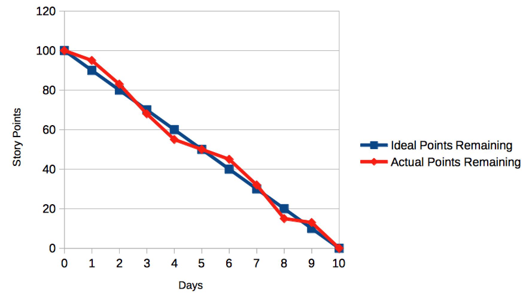
The Sprint Burn-Down is a simple chart that is created by mapping Story Points on the Y-Axis, and the number of days in the Sprint form the X-Axis. Starting with the first day of the Sprint, plot the total number of Story Points for all Stories in the Sprint Backlog atop the Y-Axis. A straight line should then be drawn from that point, and connecting it with zero Story Points remaining on the last day of the Sprint. Your chart should look like this:
As time progresses during the Sprint, the Team will complete some User Stories. As they do, the total number of Story Points remaining in the Sprint will decrease. This decrease can be plotted as an “Actual Points Remaining” line on the Sprint Burn-Down Chart.
Frequency
The Sprint Burn-Down Chart should be updated at least daily. If you’re using a tool such as JIRA, updates to this chart should be automatic when Stories are completed.
Examples
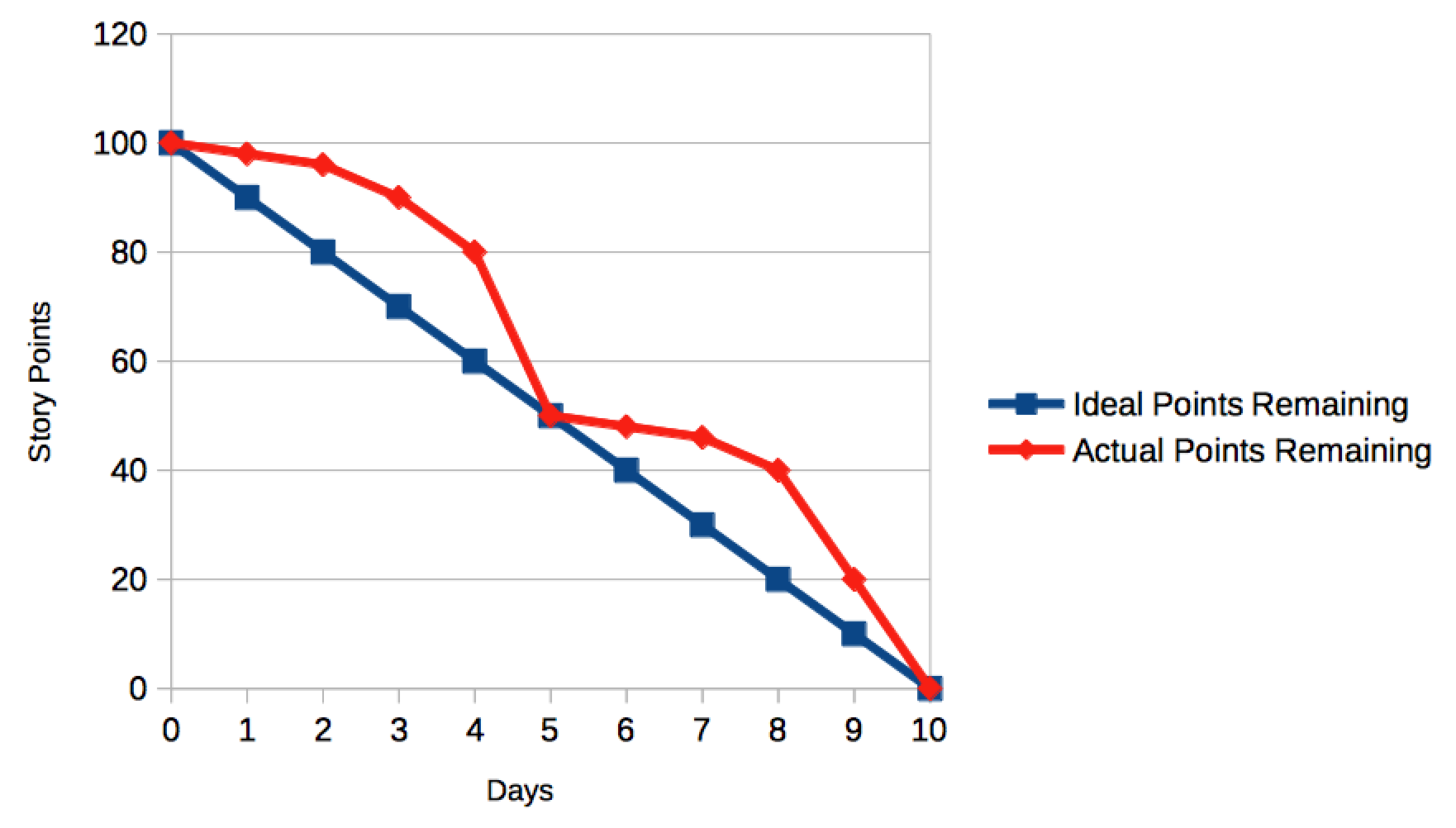
A Team that is “doing well” on their Sprint will complete User Stories throughout the entire Sprint, and their Actual Points Remaining line will track closely with the Ideal Points Remaining line that was plotted at the start of the Sprint.
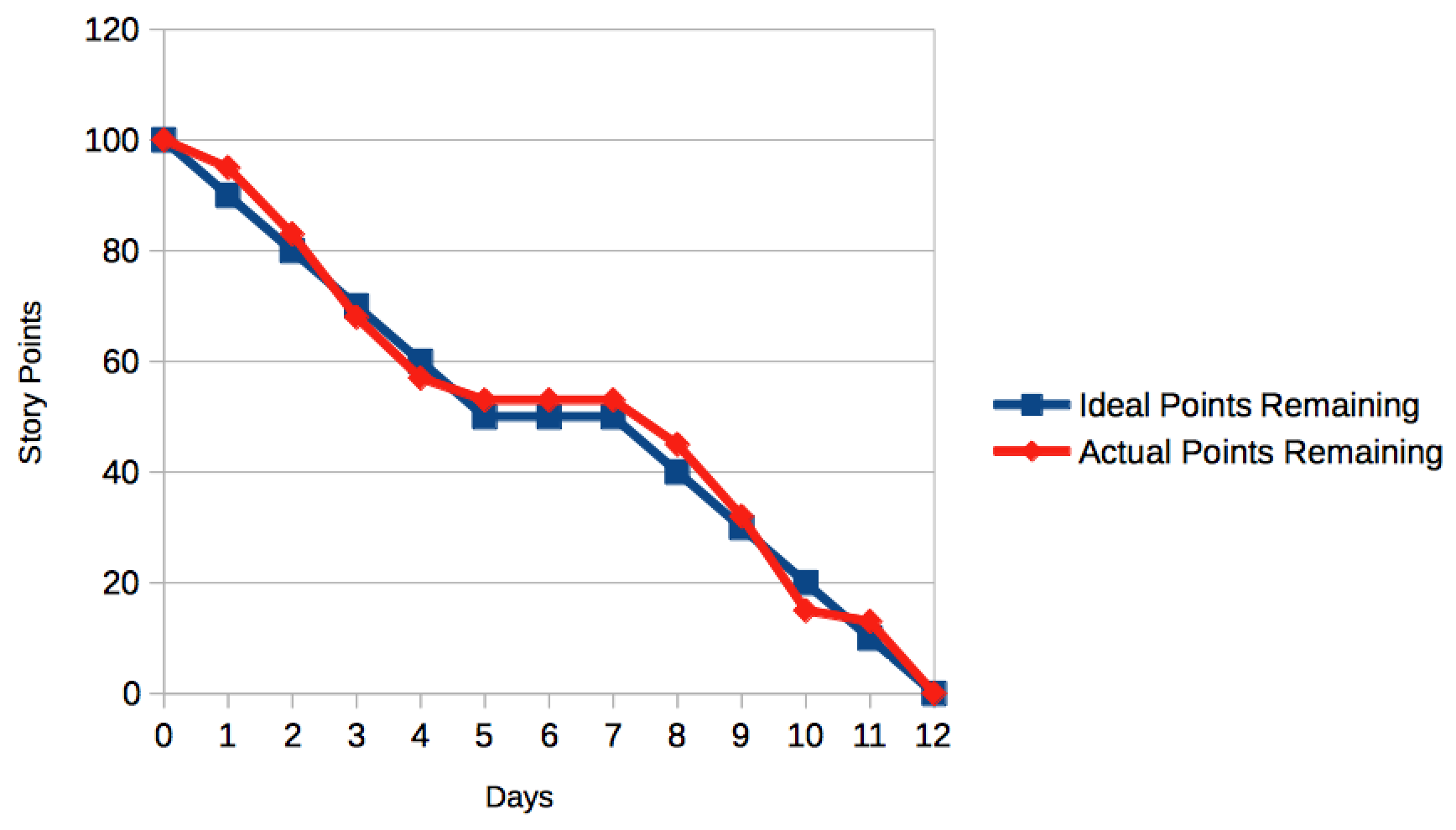
Some tools will automatically include days where no work is expected to be completed on weekends. These charts will end up looking like this:
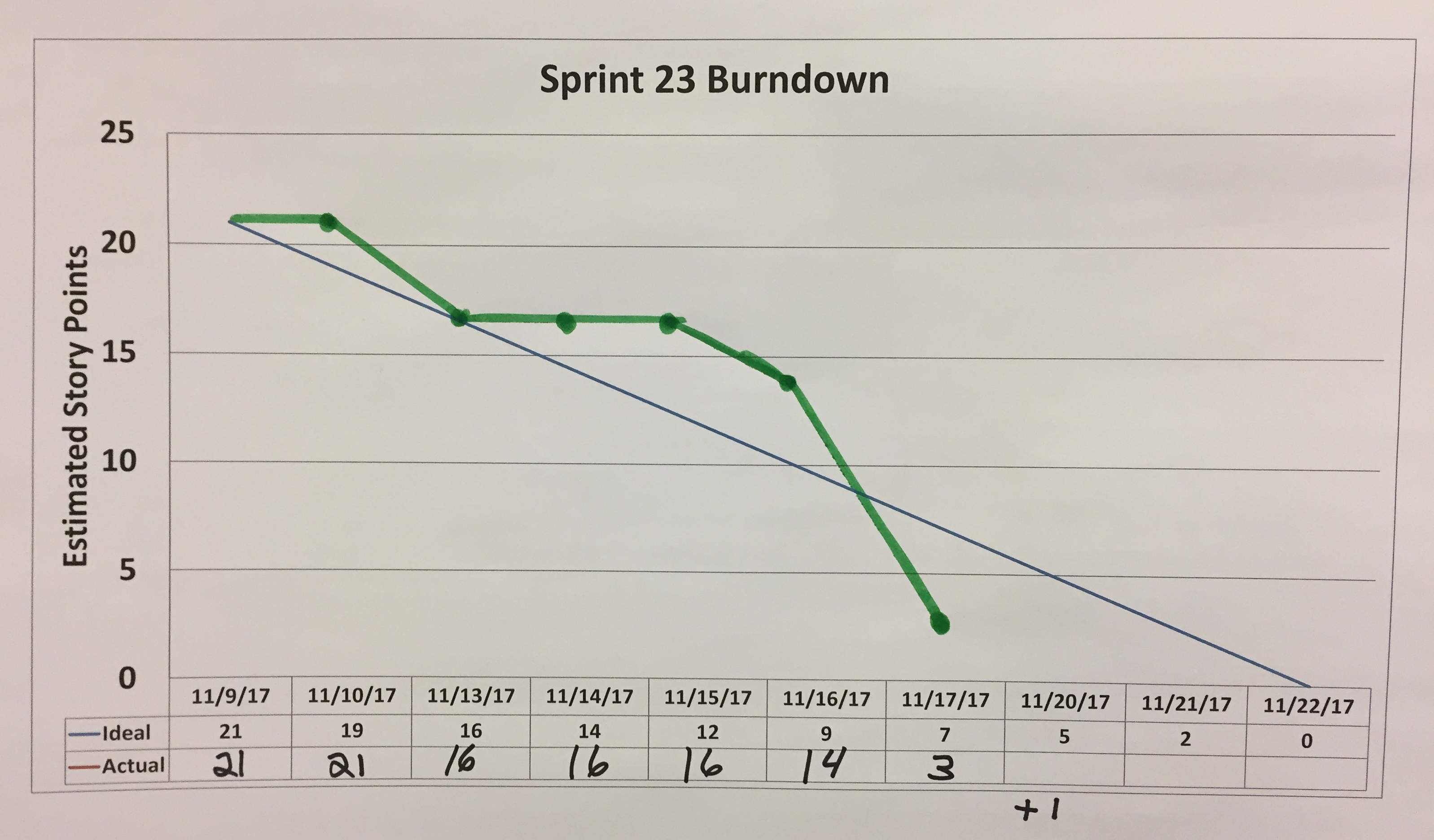
Sometimes, however, Teams are not able to complete all of the Stories they signed up for by the end of the Sprint. This unfinished work then returns to the Product Backlog, and should get re-prioritized during the next Sprint Planning meeting.
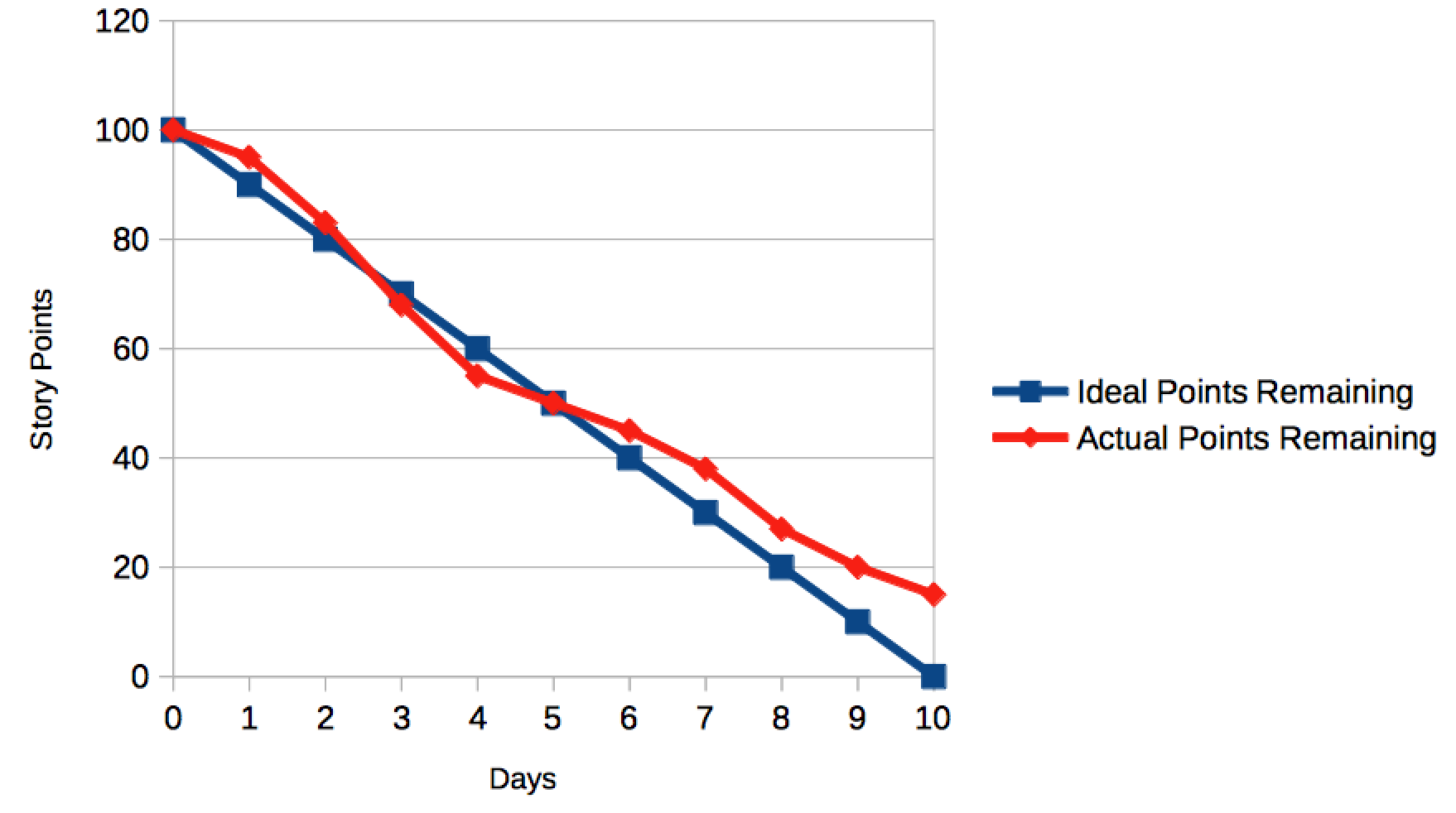
Other times, the Teams will see that they’re tracking towards an incomplete Sprint as above, and then they’ll stretch to complete it. This might indicate a team working at an unsustainable pace to get things done.
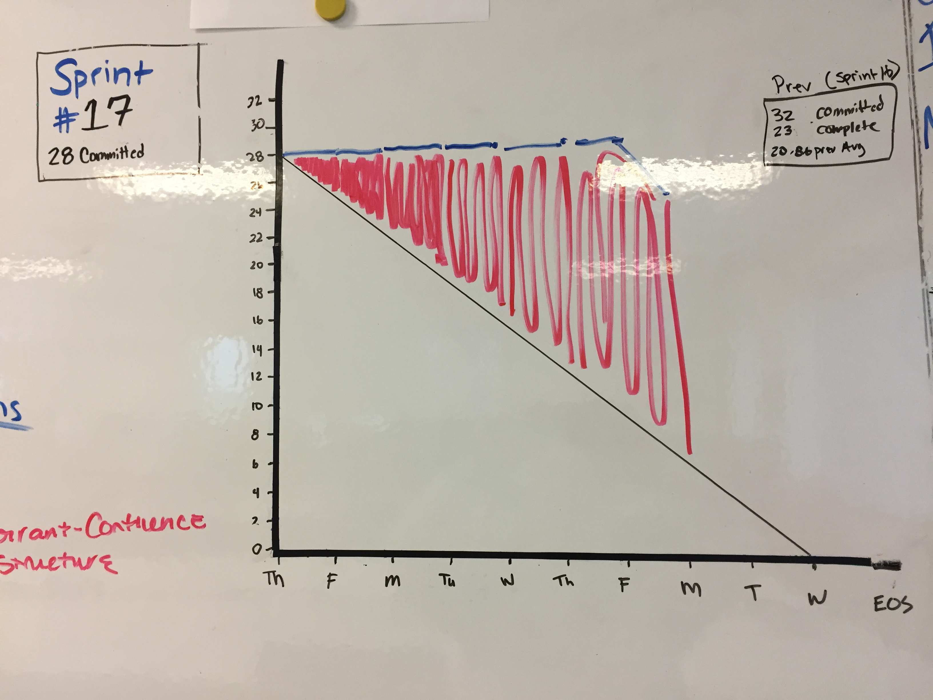
There might also be inconsistencies in the Team’s completion rate of stories:
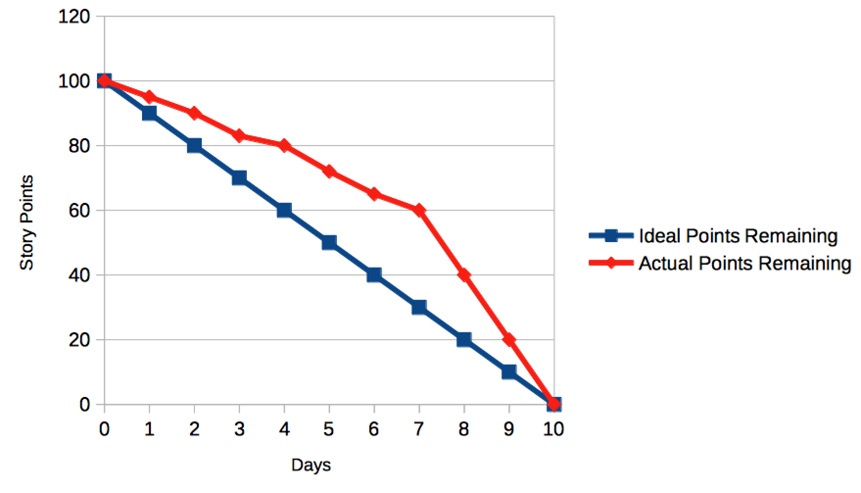
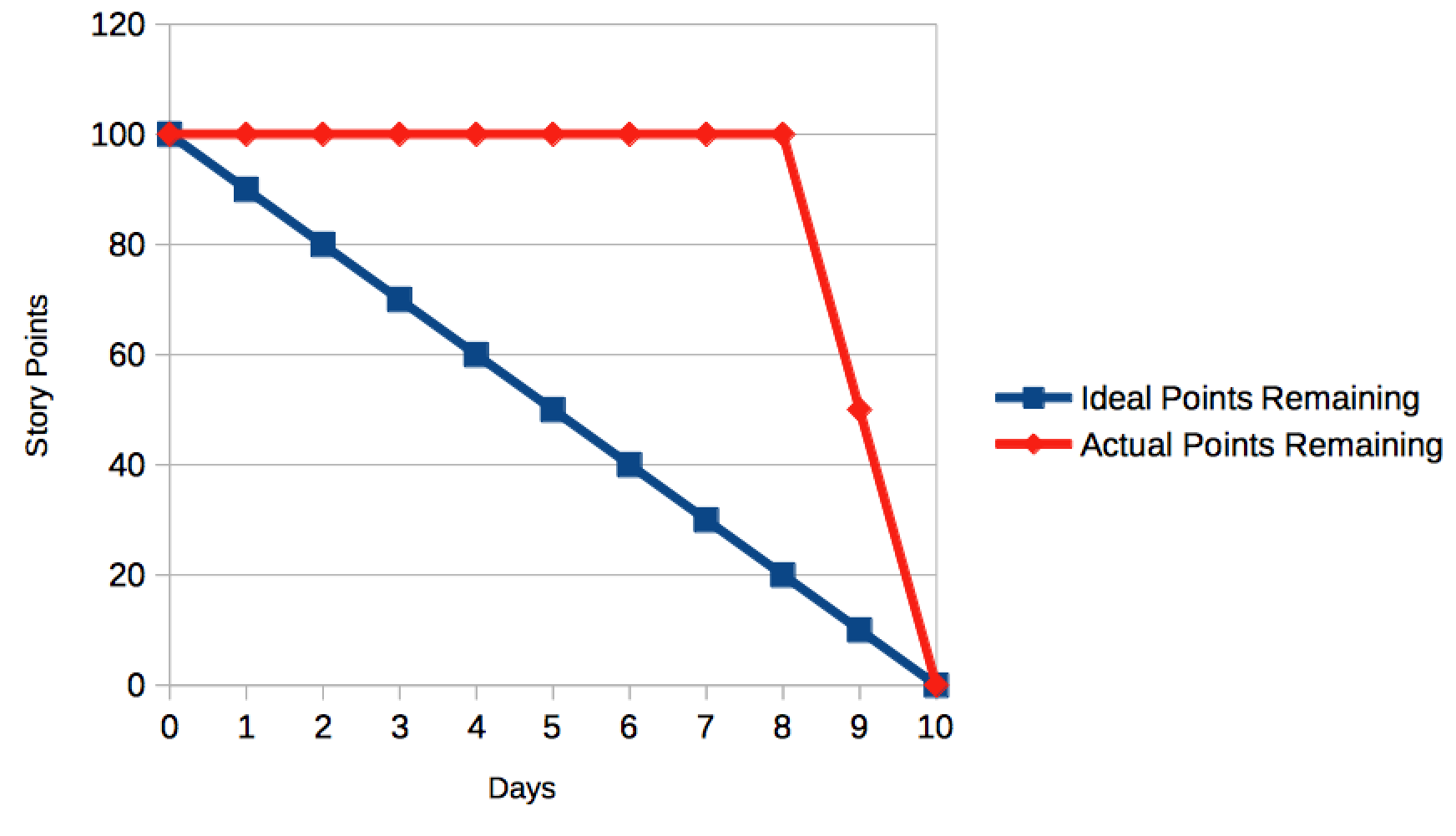
Finally, you might see a “Burn-Down Cliff,” which might be indicative of inconsistent delivery coupled with a skills gap. For example, the developers might be working on code until the final few days of the Sprint, when all of their work is then completed and turned over to the testers, who then have to rush to get all of the testing done before the end of the Sprint.
Variations
So far, we’ve only been talking about using Story Points as the label for the Y-Axis of these charts. However, it’s possible to use other measures here instead of Story Points:
- Total Task Hours
- Number of Stories
- Number of Tasks
In these instances, the Burn-Down Chart still functions in exactly the same way; only the value that we’re tracking on the Y-Axis changes.
Analog Examples
You do not need to rely upon tools like JIRA or spreadsheets to create your Sprint Burn-Down Charts. Here are a couple of hand-drawn examples from teams within clients I’ve worked with in the past.